


Learn to design a responsive website with the course. The course teaches you to design websites for any types of …
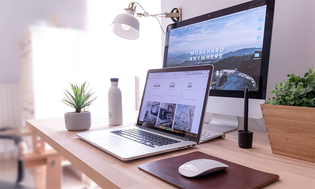
Learn to design a responsive website with the Modern Web Design Diploma Level 3 course.
The course teaches you to design websites for any types of device covering desktop monitor. You will find an organization that does not have any website. Because of the emergence of the mobile user, it becomes inevitable for all to make the website compatible for mobile users. Old website owners spend a lot to make their website ready for mobile. The course covers the essential areas you need to know for designing a responsive website.
The course teaches you the procedures of developing a responsive website using Balsamiq Mockups, Photoshop, Zeplin and Invision App. The course also shows the strategies for design for the developers.
By the end of the course, you will able to design a responsive website.
There is no experience or previous qualifications required for enrolment on this course. It is available to all students, of all academic backgrounds.
The course is assessed online with a multiple-choice test, which is marked automatically. You will know instantly whether you have passed or not. Those who pass this test will have the qualification of Modern Web Design Diploma Level 3. Certificate will be produced in PDF format at an additional cost of £8.99, Printed Hardcopy at £12.99 and both at £19.99.
| Introduction | |||
| 0.1 promo-workflow | 00:03:00 | ||
| 0.2 what we will cover in this course | 00:03:00 | ||
| Requirements to take this course | |||
| 1.1 skills-and-apps-you-need-to-take-this-courseautogenerated | 00:02:00 | ||
| 1.2. Photoshop extensions We Need | 00:07:00 | ||
| Organizing your Web Design Project | |||
| 2.1.how To Organize A Design Project | 00:05:00 | ||
| 2.2 client’s Sketches | 00:04:00 | ||
| 2.2 naming psd layers and groups | 00:06:00 | ||
| 2.3.naming Conventions To Help Developers | 00:03:00 | ||
| Gathering project information from client | |||
| 3.1.design Briefs | 00:10:00 | ||
| 3.3 getting More Info On Project | 00:05:00 | ||
| 3.4.content_template for gathering information | 00:03:00 | ||
| Sketching, Wireframing, Atomic Design & 8point Grid system | |||
| 4.1.moodboards | 00:06:00 | ||
| 4.2.ideation Phase | 00:05:00 | ||
| 4.3.introduction To Balsamiq | 00:10:00 | ||
| 4.4desining Wireframes Part 1 | 00:08:00 | ||
| 4.5.desining Wireframes Part 2 | 00:14:00 | ||
| 4.6.atomic Design | 00:08:00 | ||
| 4.7.8pt Grid | 00:09:00 | ||
| Style Guides, colors and typographics scales | |||
| 5.1.typeface And Color Combinations | 00:04:00 | ||
| 5.2.ui Style Guides | 00:08:00 | ||
| 5.3.examples Of Ui Style Guides | 00:03:00 | ||
| 5.4.how I Created My Style Guide | 00:07:00 | ||
| 5.5.styleguide-typescale Explained | 00:03:00 | ||
| 5.6.Styleguide-assignment | 00:01:00 | ||
| Designing for Desktop/Large View (Wstudio Web Design Project) | |||
| 6.1.online tools for grid calcuations | 00:13:00 | ||
| 6.2.planning your grid | 00:05:00 | ||
| 6.3.whitespace-plan | 00:06:00 | ||
| 6.4.setting Up Artboard For Desktop Design | 00:07:00 | ||
| 6.5.designing Header And Hero Part 1 | 00:12:00 | ||
| 6.6 designing Header And Hero Part 2 | 00:09:00 | ||
| 6.7.designing Steps Area Part 1 | 00:10:00 | ||
| 6.8.designing Step Area Part 2 | 00:09:00 | ||
| 6.9.userreviews Area Design | 00:09:00 | ||
| 6.10.adjusting White Space And Vertical Rhythem | 00:06:00 | ||
| 6.11.desining Team Part1 | 00:11:00 | ||
| 6.12.desining Team Part2 | 00:07:00 | ||
| 6.13.footer Design Part1 | 00:08:00 | ||
| 6.14.footer Design Part2 | 00:11:00 | ||
| Planning Responsive Web Design | |||
| 7.1.Responsive Design Considerations Part 1 | 00:07:00 | ||
| 7.2.Responsive Design Considerations Part 2 | 00:06:00 | ||
| Designing for Tablet/Medium View (Wstudio Web Design Project) | |||
| 7.3.Establishing Grid For Tablets | 00:07:00 | ||
| 7.4.Header Area For Tablet View | 00:11:00 | ||
| 7.5.Section how it work – steps | 00:10:00 | ||
| 7.6.Section team Tablet View | 00:09:00 | ||
| 7.7 footer Design | 00:09:00 | ||
| Designing for Mobile/Small View (Wstudio Web Design Project) | |||
| 8.1.mobile Artboard And Grids | 00:04:00 | ||
| 8.2.header Mobile View | 00:11:00 | ||
| 8.3.steps Section-mobile | 00:09:00 | ||
| 8.4.section 2 Team Members For Mobile | 00:09:00 | ||
| 8.5.footer And Final Adjustments | 00:08:00 | ||
| Designing for Developers | |||
| 9.1.what Developes Needs To Know | 00:05:00 | ||
| 9.2.Red Line Document with Ink 1 | 00:10:00 | ||
| 9.3.Red Line Document with Ink 2 | 00:06:00 | ||
| 9.4.which layer styles you can use photoshop | 00:08:00 | ||
| 9.5.installing Using Zeplin | 00:10:00 | ||
| 9.6.style Guides With Zeplin | 00:14:00 | ||
| 9.7.tools-zeplin-avocode-1 | 00:04:00 | ||
| 9.8.avocode And Sympli | 00:06:00 | ||
| Prototyping with Invision app | |||
| 10.1. What Are Prototypes | 00:04:00 | ||
| 10.2.getting Familiar With Invision App For Prototyping | 00:07:00 | ||
| 10.3.creating First Prototype With Invision App | 00:06:00 | ||
| SVGs and Icon Fonts in Web Design | |||
| 11.1 using iconmoon app to create custom icon fonts set | 00:08:00 | ||
| 11.2 Using SVG in Web design | 00:10:00 | ||
| Certificate and Transcript | |||
| Order Your Certificates or Transcripts | 00:00:00 | ||
No Reviews found for this course.


copyright © LIBM